What Is a YouTube End Screen?
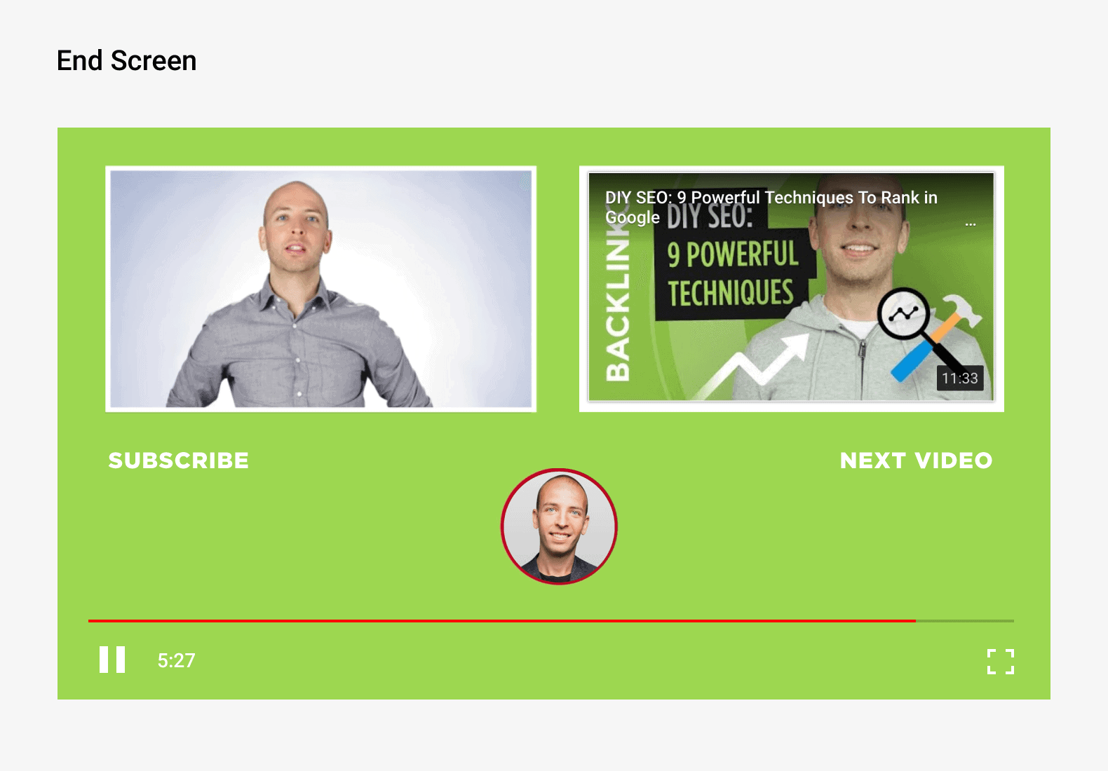
An End Screen (also referred to as an “End Card” or “Endslate”) is a YouTube feature that appears in the last 5-20 seconds of a video. YouTubers can use their end screen to promote videos, playlists, merchandise and external websites.
Why Is Your End Screen Important?
Your End Screen can help you get more views, traffic and subscribers from every video.
Here’s how:
When someone finishes watching your video, there are a thousand things they can do next. They can watch another video in the Suggested Video sidebar. They can head back to YouTube’s homepage. Heck, they can even leave YouTube altogether.
Your End Screen increases the odds that your viewer does what you want them to do (specifically: watch more of your videos and subscribe!).
Specifically, you can use your End Screen to link to other videos and playlists. You can also include a sizable subscribe button on-screen.
Best Practices
Choose What to Promote
Your first step is to decide what you’re going to promote in your End Screen.
YouTube allows you to promote four “elements” in each End Screen:
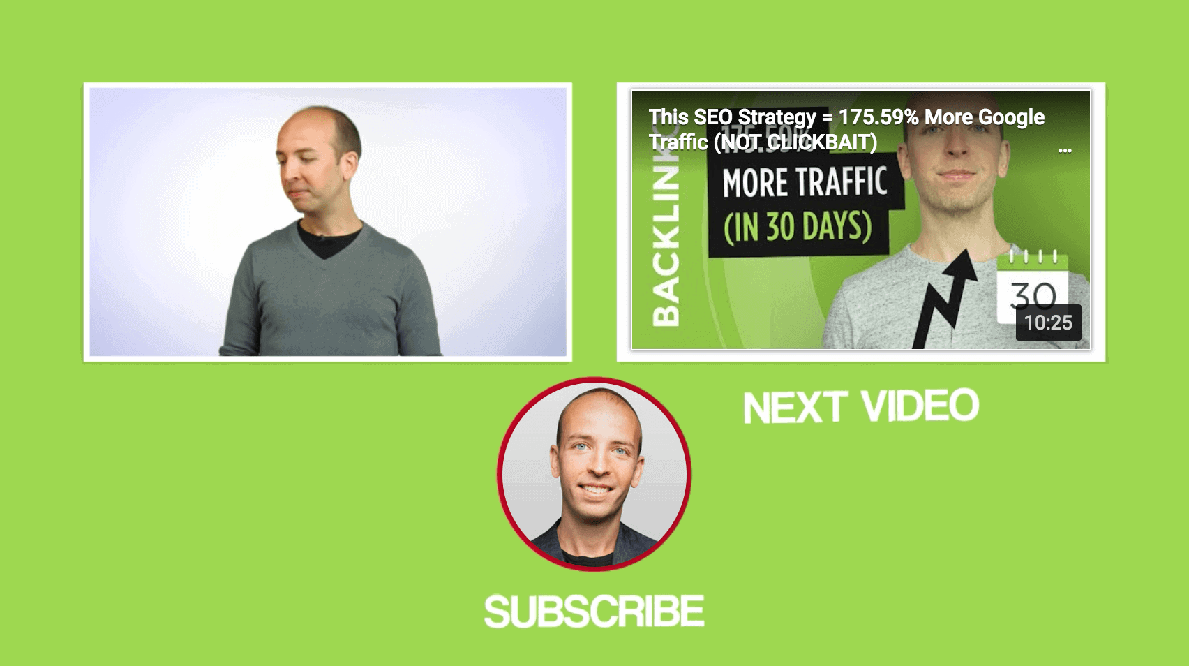
- Subscribe Button: This is a clickable button that lets people subscribe to your channel from within your End Screen.
- Video or Playlist: Send viewers to a specific video or playlist (from your channel or another channel).
- Channel: Link to another YouTube channel that you want your audience to check out.
- External Site: Send viewers to your associated website… or a set of YouTube-approved sites.
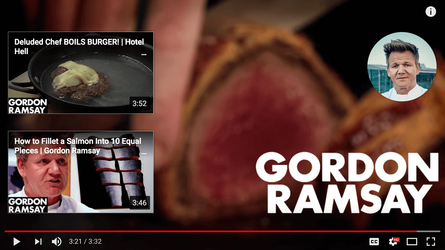
In general, you want to only use 2-3 elements in each End Screen. Any more than that and your End Screen will look cluttered (in other words: if you give your viewers too many options, they’ll choose none).
For example, Gordon Ramsay only uses two elements in his end screen:
Promote The Right Video
Most YouTubers feature another video from their channel in their End Screens.
Why?
First off, this can significantly increase your channel’s monthly views.
But even more important than that: the more content someone sees, the more likely they are to become a subscriber. And featuring a video in your end screen is one of the best ways to get people to watch more of your videos.
That said: how do you decide which video to promote in your End Screen?
You have two main options:
- Choose a High-Converting Video: Promote a video that turns an above-average amount of viewers into channel subscribers. This video is proven to convert, so it makes sense to promote it wherever you can. You can find these high-converting videos in the “YouTube Watch Page” section of your YouTube subscriber report.

- Choose a Related Video: Feature a video that’s closely-related to the one they just watched… or a video that will help your viewer take the next step.
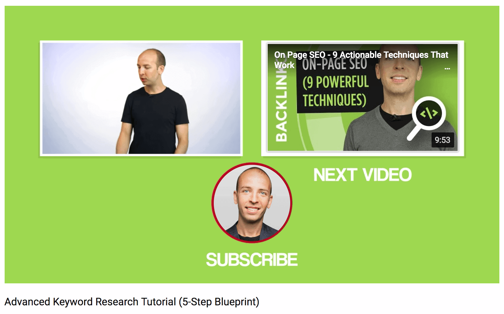
For example, this video lists out a few different keyword research strategies:

What’s someone that just learned how to find keywords is going to need next? Ways to use those keywords on their site.
So that End Screen links to a video about on-page SEO:
Include a Subscribe Element
If you want more subscribers on YouTube (and who doesn’t?), make sure to include a subscribe element to your End Screen.
There’s not much you can do to edit or design this element (YouTube simply uses your Channel Icon).
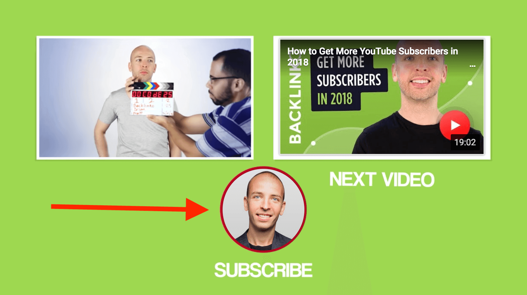
And when someone hovers over the element, it turns into a more traditional-looking subscribe button:
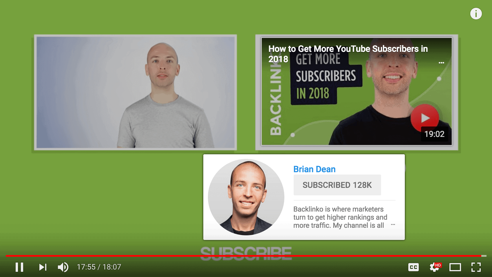
That said, while you can’t edit or design the element itself, you can control what’s around it.
For many people on YouTube, the subscribe element can be confusing. It doesn’t scream: “Click on this to subscribe!”.
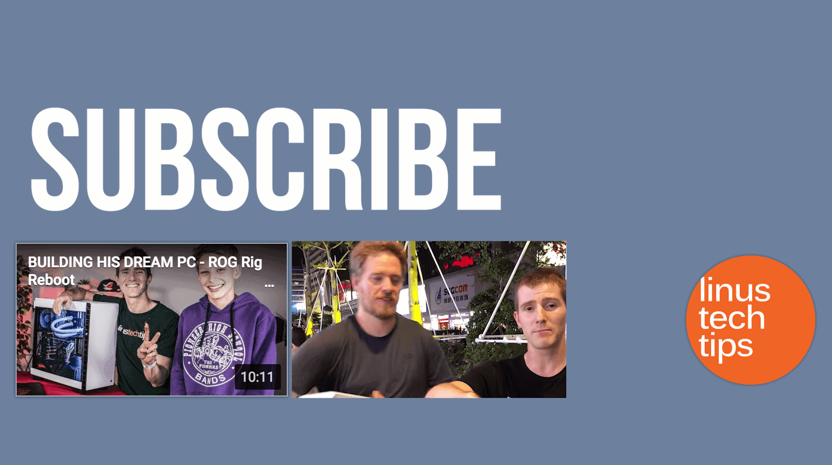
So to make things more clear, include terms like “Subscribe” or “Subscribe to My Channel” around your subscribe element.
For example, Linus Tech Tips has an unmissable “Subscribe” plastered right over his end screen:
Send Traffic to Your Site (Optional)
You can use your End Screen to funnel YouTube viewers to your site.
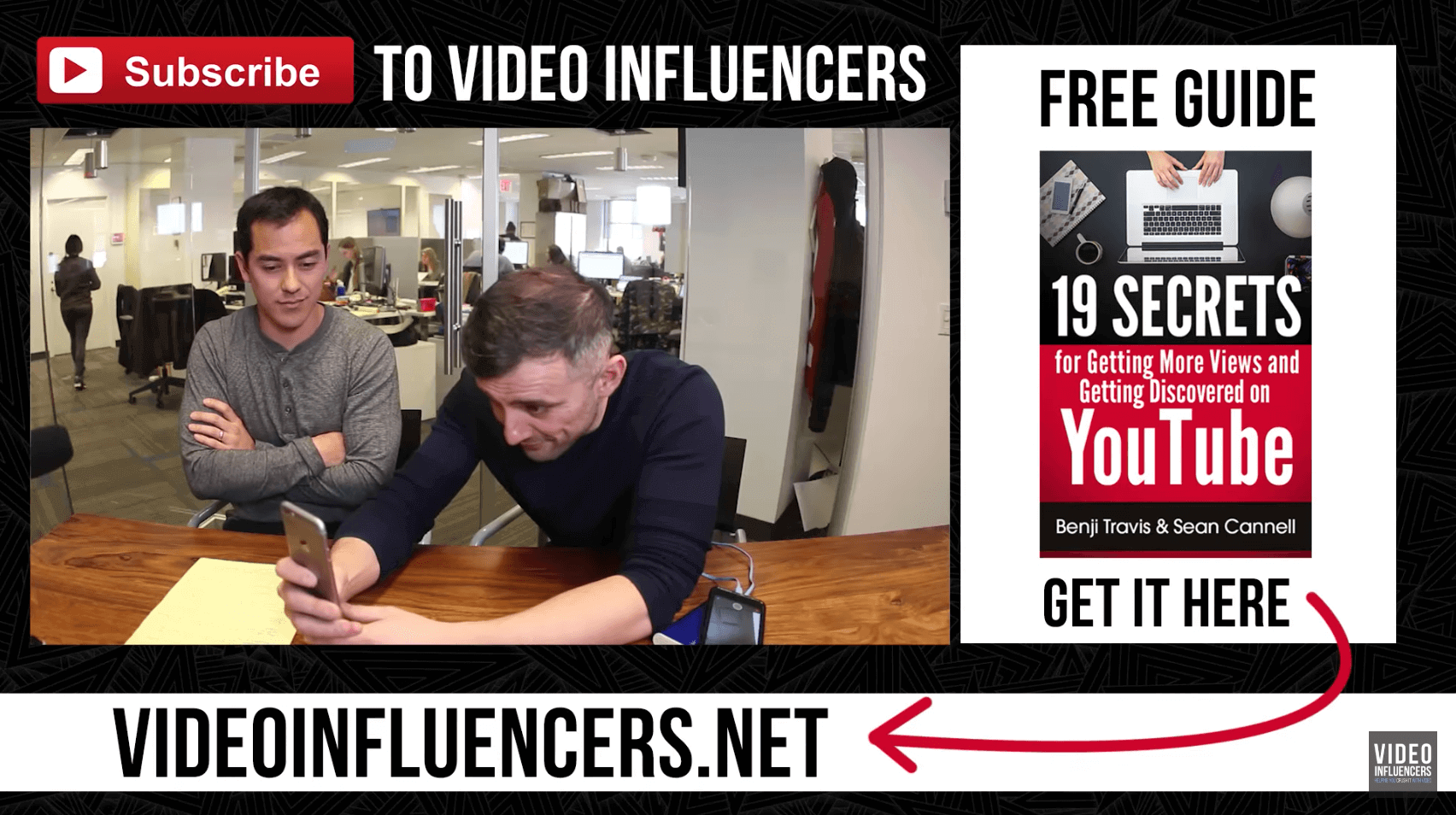
If you go this route, avoid sending people to your homepage. Instead, offer viewers something specific that they can get by visiting your site, like an ebook, report, or course.
For example, Video Influencers promote an ebook on their website on their End Screen:
How to Setup Your End Screen
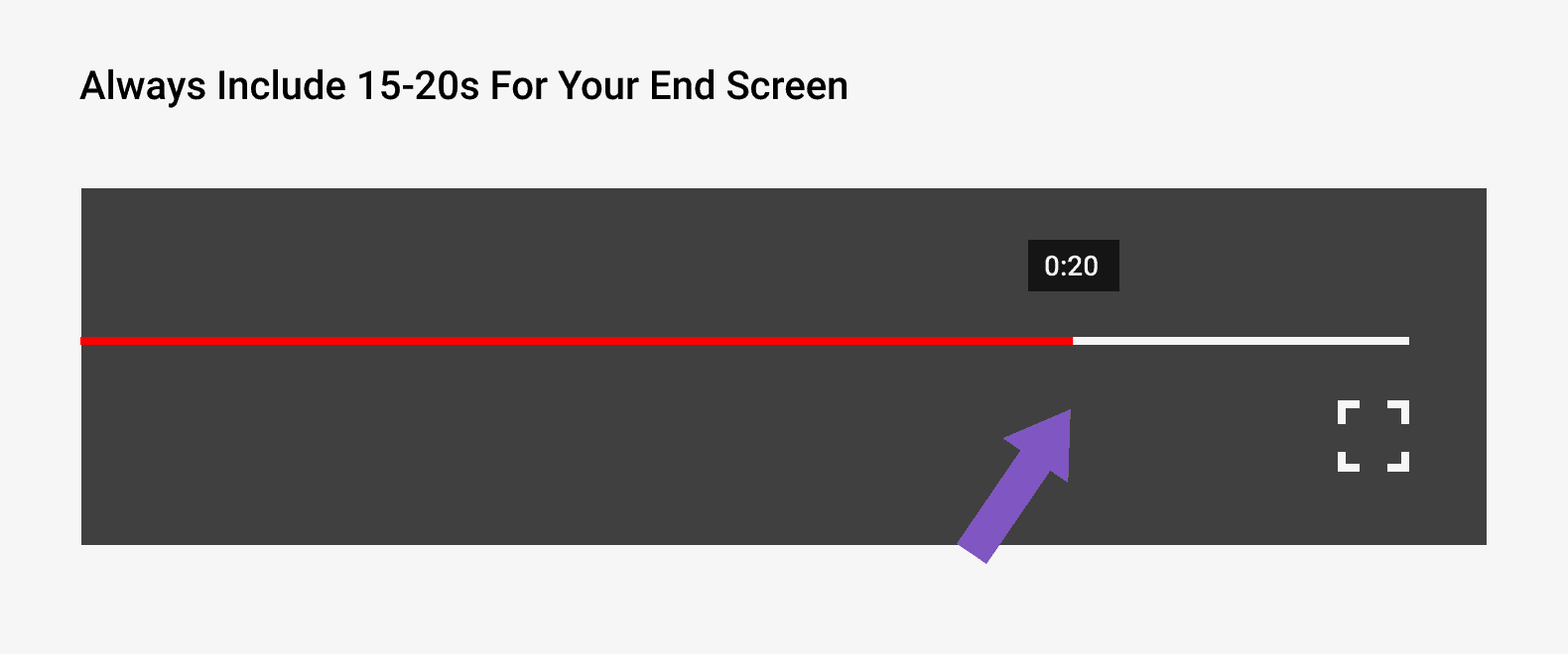
You’re not able to tack on an End Screen to the end of a video. So you need to include 5-20 seconds of space at the end of your video specifically for your End Screen.
For example, here’s an example of an End Screen before a video is uploaded to YouTube:
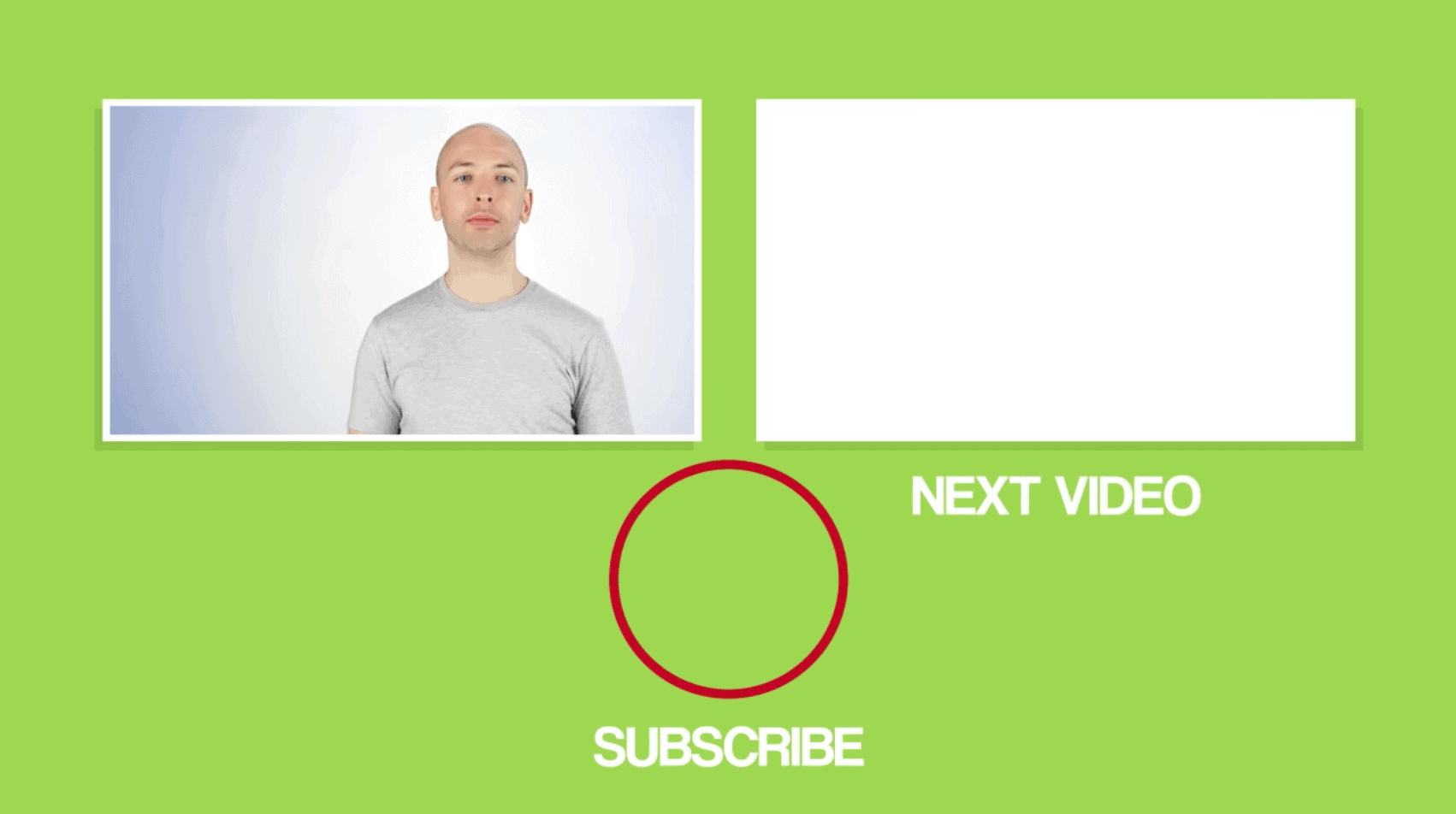
As you can see, elements haven’t been added yet. But the video was created and edited with an End Screen in mind. It even has placeholders for the various elements to go.
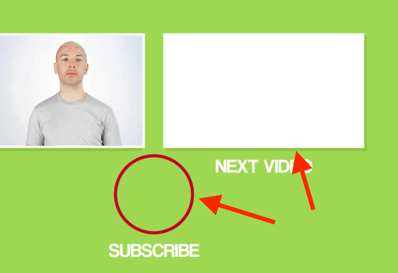
And once you upload your video to YouTube, you can easily drag and drop different End Screen elements to the last 5-20 seconds of your video:
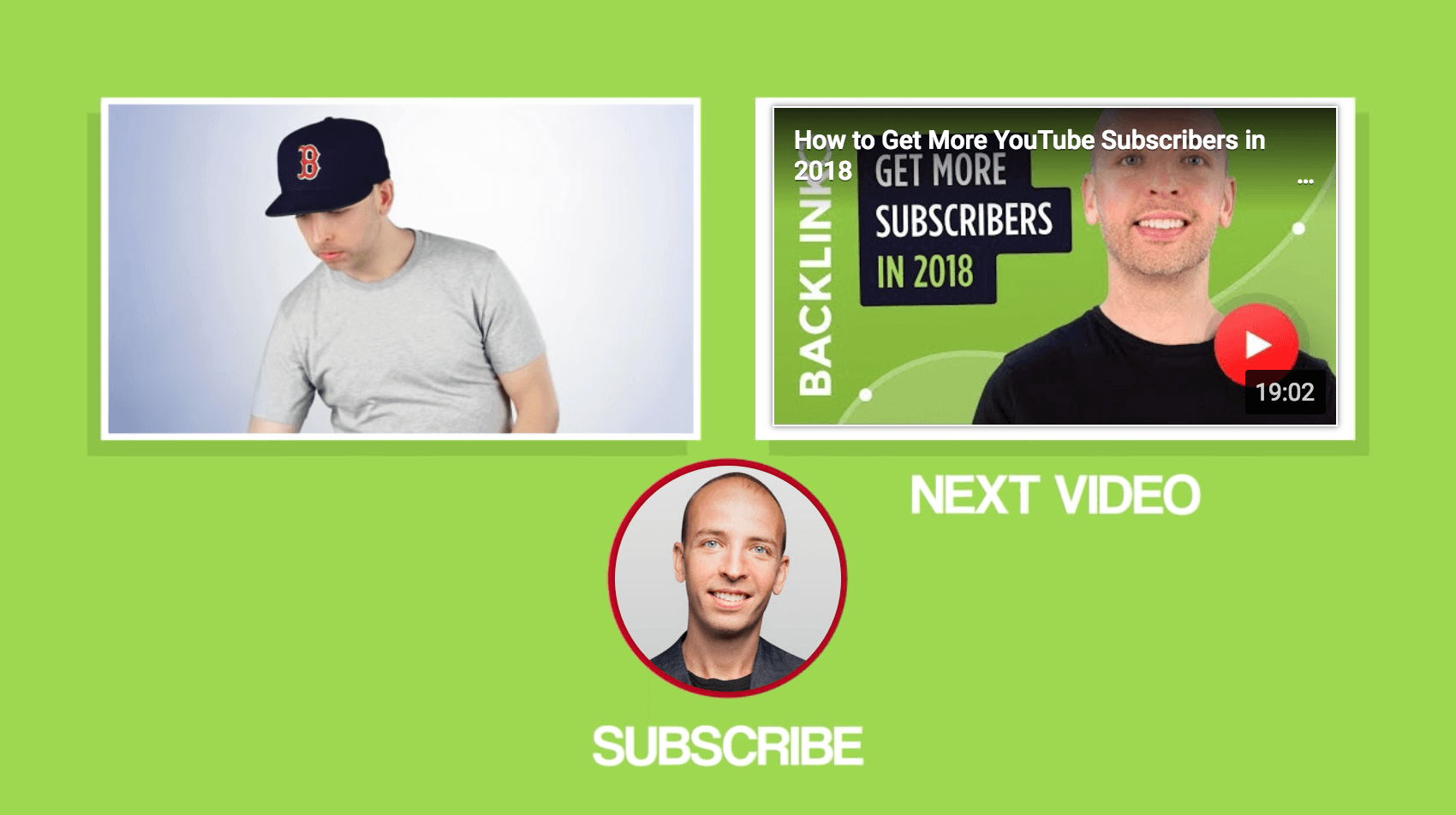
Track Your Progress
One cool thing about End Screens is that you can easily add, delete or change elements.
And an even cooler thing is that you can use data to help you decide what stays and what goes.
Specifically, you can use the End Screen report in YouTube Analytics to see how your End Screens are performing.
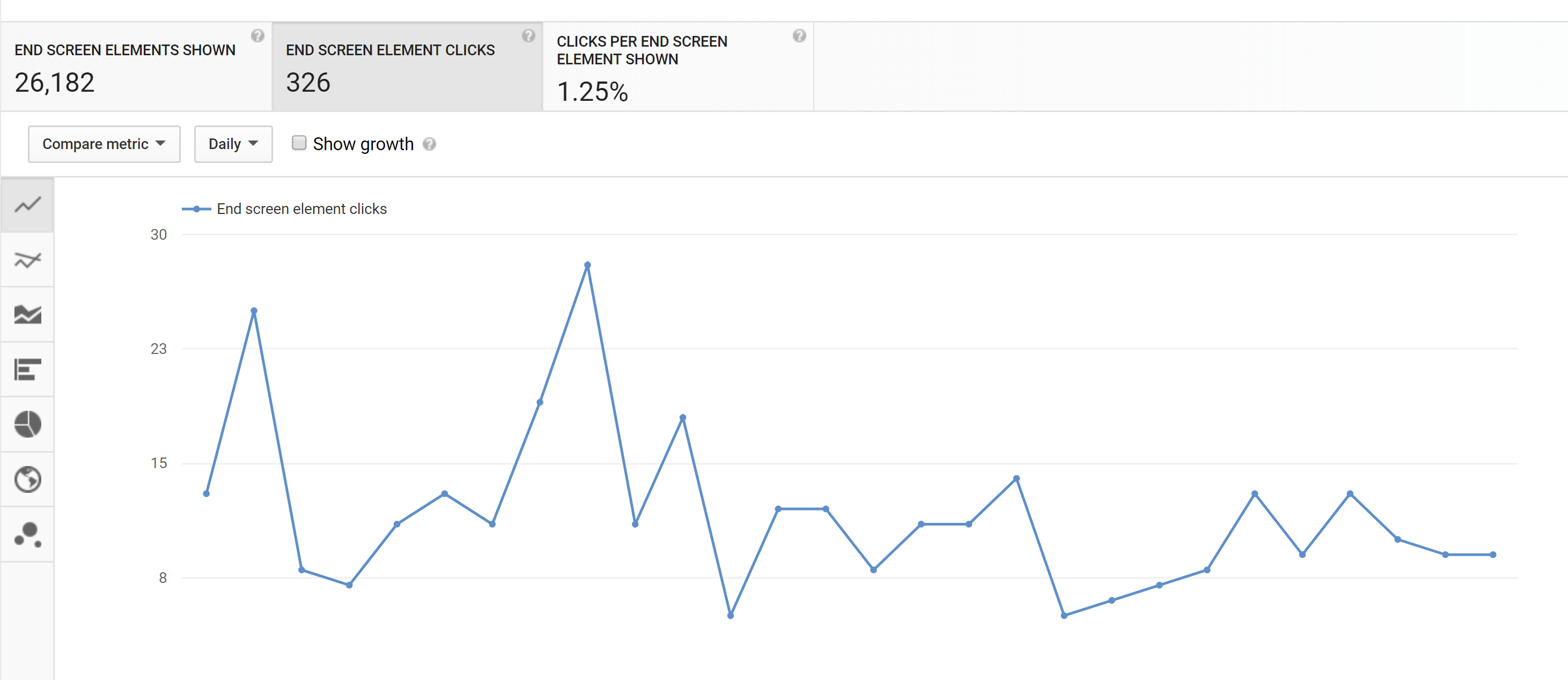
If you see that one particular End Screen element is crushing it, add it to more of your videos. Or, if another element is getting ignored, you can delete it or try something new.
Tips and Advanced Strategies
- Label Your Videos: Use terms like “Watch Next” or “Next Video” around your video element. This helps people understand that the element is clickable and encourages people to watch the video. As you can see, Marie Forleo strategically uses the text “Watch This Next” on her end screen.

- Add Social Icons: Consider adding icons to the social media sites you’re most active on. These icons aren’t clickable. But they let people know that you’re on those platforms. Here’s an example from crossfit channel OFFICIALTHENX:

Use a Verbal CTA: The last thing you want to do is end your amazing video with a silent end screen. Instead, consider adding audio over your end screen that includes a call-to-action to watch another video or subscribe. For example, DidYouKnowGaming plays an audio track over their end screen that lets viewers know what to do next.
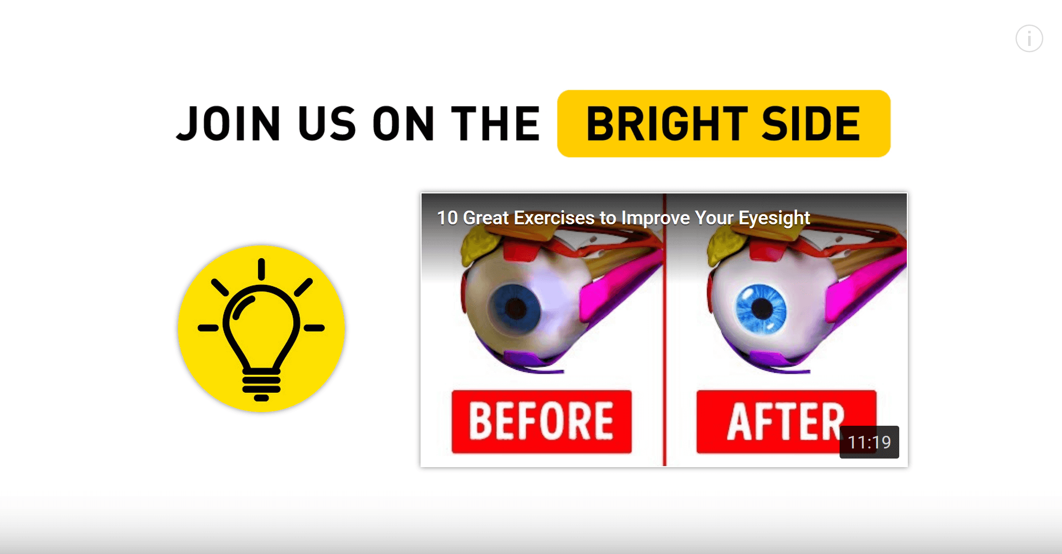
- Keep Your End Screen Uncluttered: That way, the focus is on your End Screen elements. For example, Bright Side uses a plain white background. That way, their End Screen elements really stand out:
- Promote a Playlist: Consider featuring a playlist in your End Screen instead of a single video. When someone watches a playlist, videos from that playlist continue to play automatically, which can land you more views.
Learn More
Add End Screens to videos: Technical steps for adding End Screens to your videos (from YouTube).
YouTube End Screen Template: Helpful guide to creating End Screens that convert.